Data visualization experiments
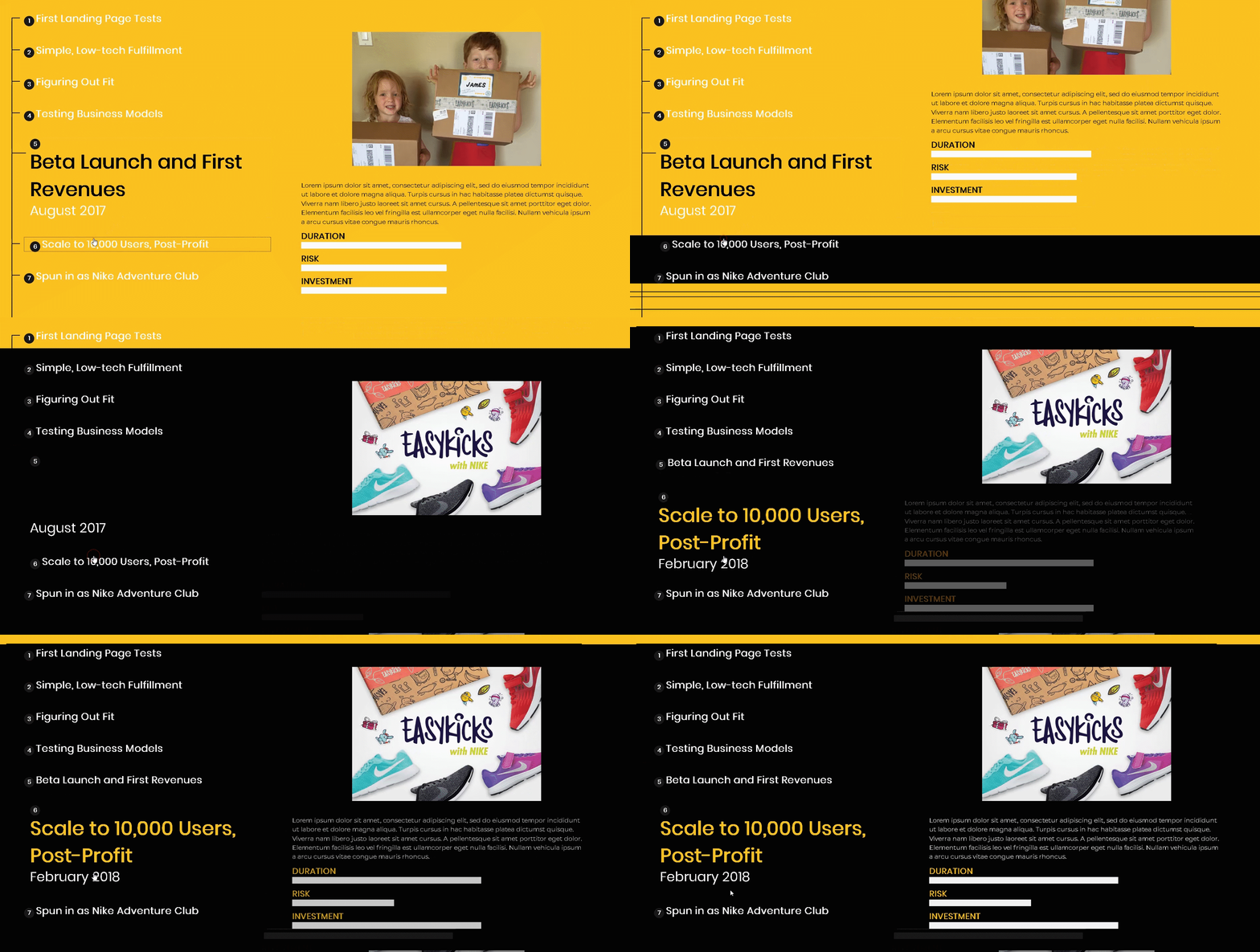
Interactive Timeline
This is a interactive timeline that allows the user navigates through 7 different events on time. Each phase has different stats, describing the state of that particular moment. This solution is responsive and allow to visualize any linear process, by highlighting step by step.
You can find the DEMO HERE
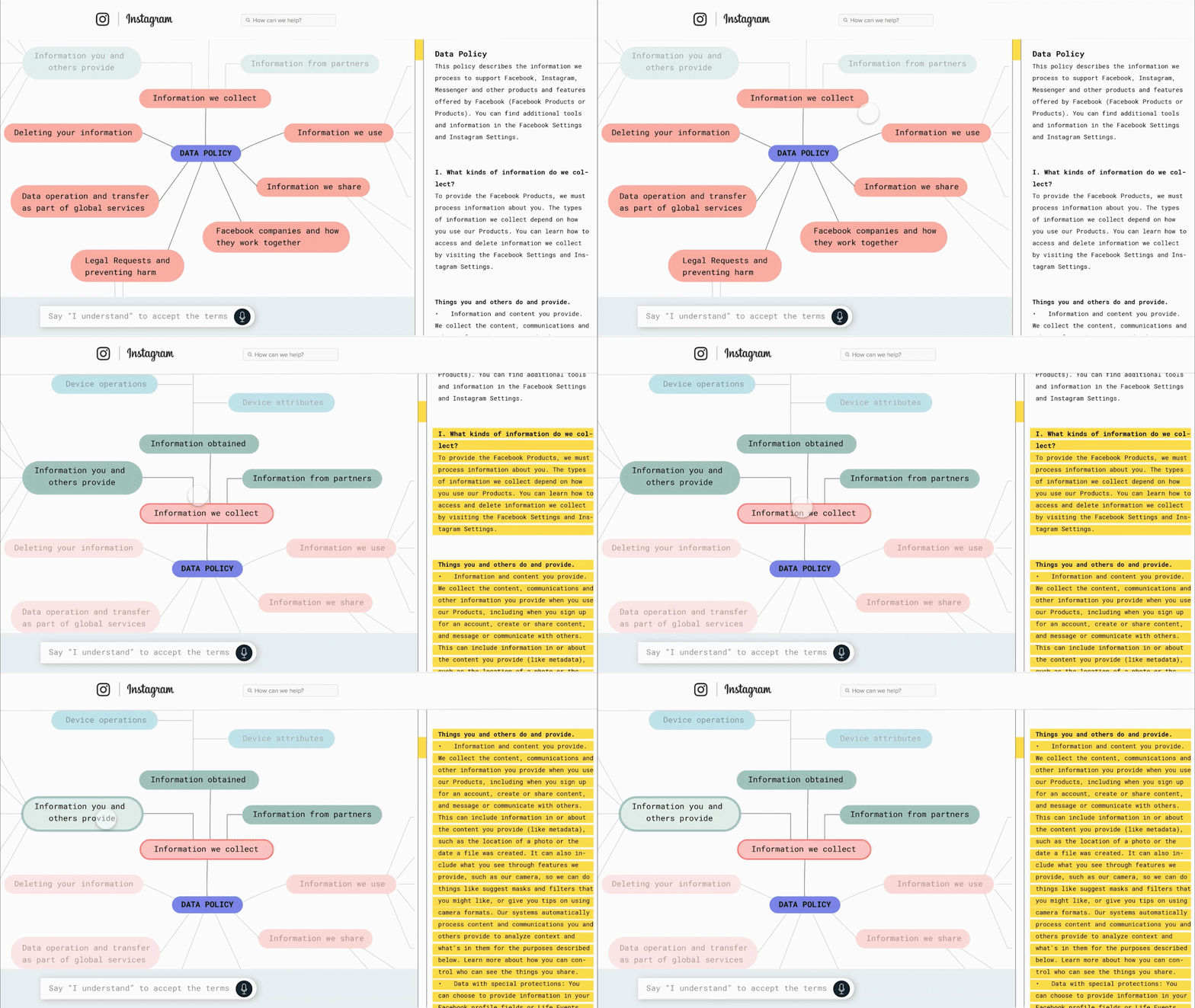
policy visualization
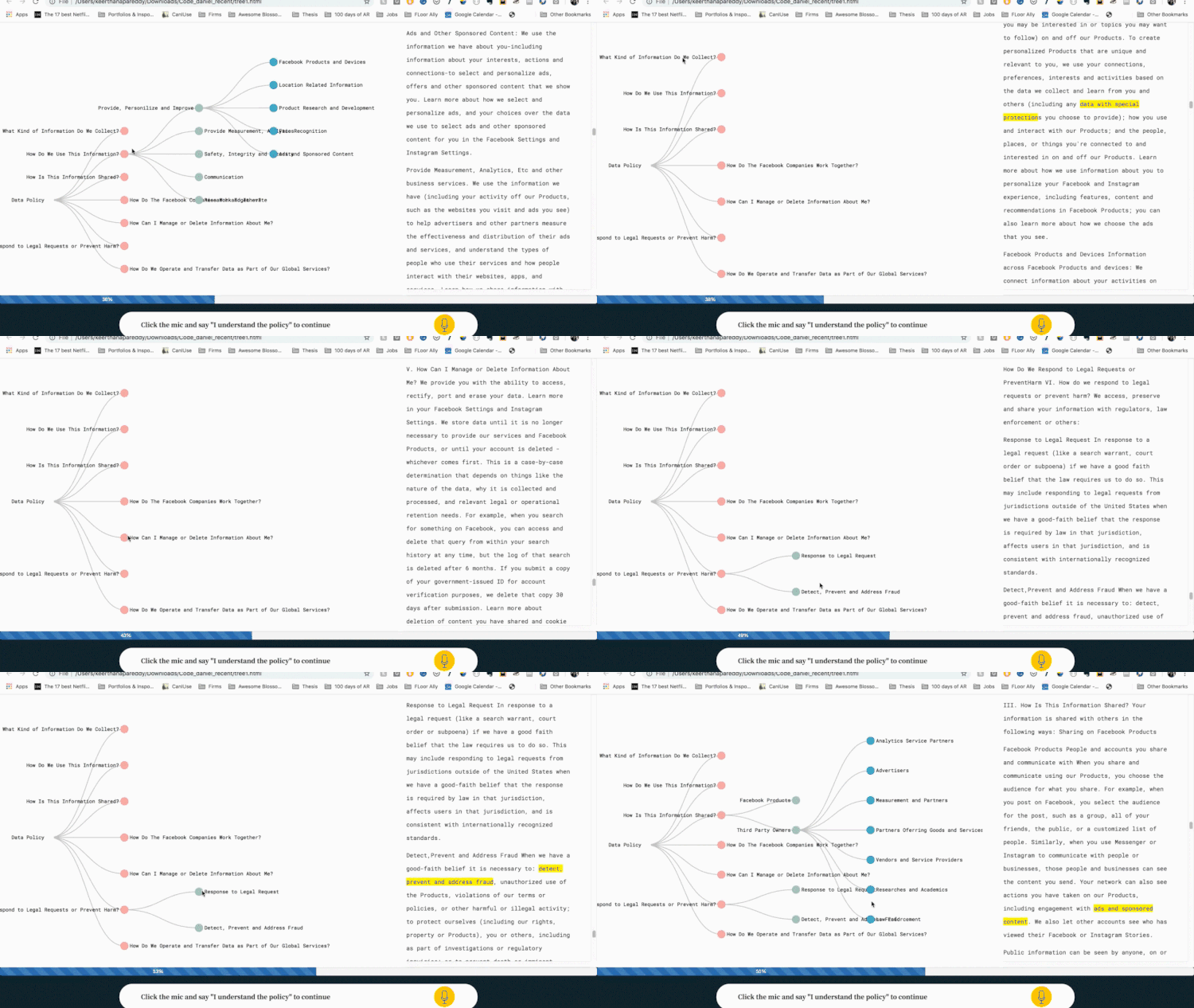
I designed a system to visualize the Instagram’s data policy. These policies statements are generally pages and pages of text that most people don’t read. This design gathers all the information in a friendly and accessible way. The graph represents the relationships between the policies and the user is able to search keywords, highlighting the relevant content. The user cannot opt-out until he or she navigates at least the 70% of the data policy statement.
Video of DEMO
game of life
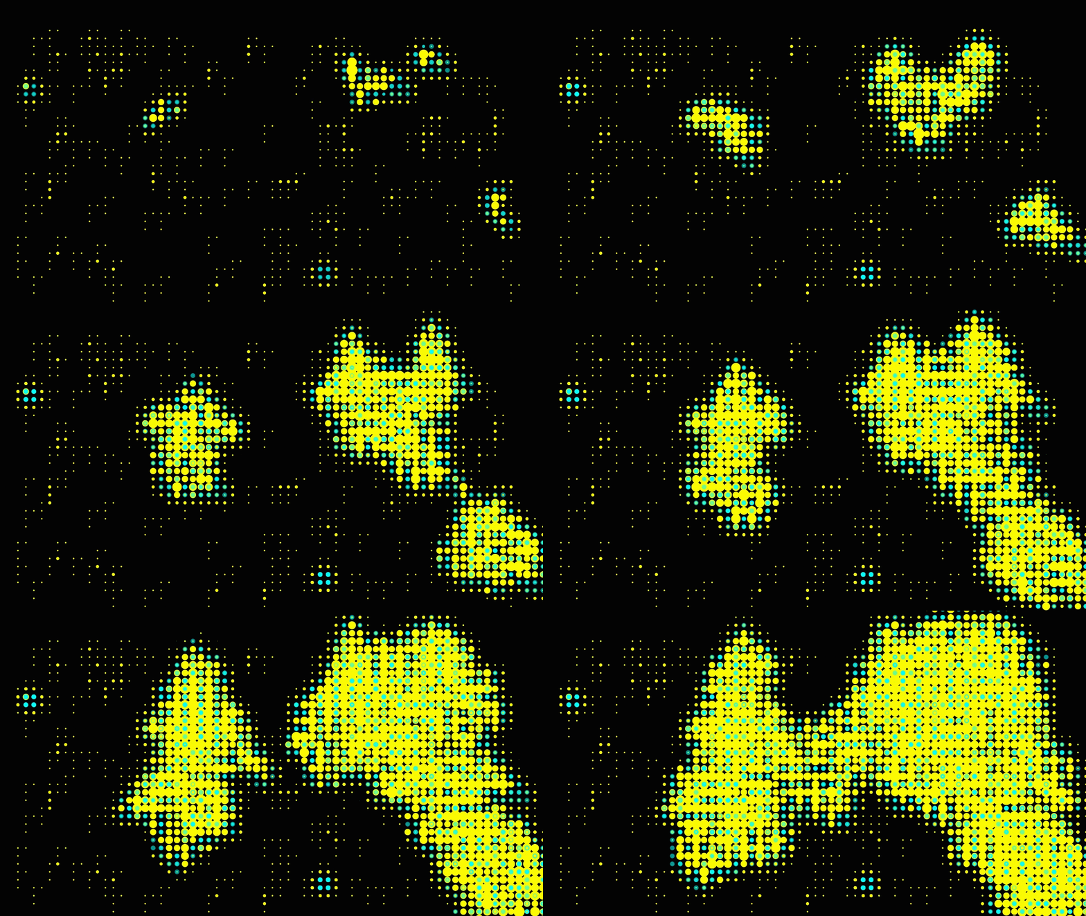
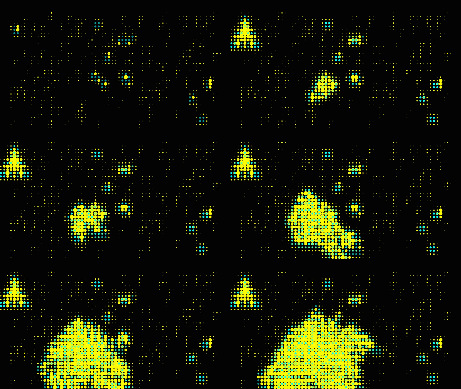
The Game of Life, also known simply as Life, is a cellular automaton devised by the British mathematician John Horton Conway in 1970.
The game is a zero-player game, meaning that its evolution is determined by its initial state, requiring no further input. One interacts with the Game of Life by creating an initial configuration and observing how it evolves.
This project visualizes random numbers and positions of seeds. Every time the mouse or any key is pressed the simulation will start all over again. Playing with two high contrast colors we can understand the born and dead rates easily. Yellow is life and Cyan is dead
You can find the DEMO HERE
mAP VISUALIZATION
Experiments with map visualizations and D3 on java-script.
World map DEMO
Country map DEMO
Designed by Daniel Castaño
HOW RANDOM
This interactive drawing uses the digital random algorithm to generate landscapes of dice. How loaded the digital die is?
Roll it and find out for yourself! You can press any key to add a new die to the grid.
You can find the DEMO HERE
Idea by: Nicolas Sanin
Redesigned by Daniel Castaño
